How to find the best Etsy keywords in 3 simple steps using Alura
If you want to be found in search results on Etsy, you need to optimize your product listing for SEO. And if you want to
join
Branding is not just a logo, and as you know I always talk first about brand clarity:
– ideal customer,
– values,
– mission,
– the tone of your voice,
so a brand personality.
And there’s a lot of other visual elements that are as much – if not more – important than your logo:
– fonts,
– color choices,
– consistency in your image style,
– patterns etc.
A logo is still one of the first things you want to have when starting your handmade shop. It’s like a stamp of approval: “I’m in business now!”. I totally understand that, but while browsing the Internet and Etsy, I’ve noticed a few things that could be improved, so I’m sharing those tips so you can make some changes if you want to or write it down for the future.
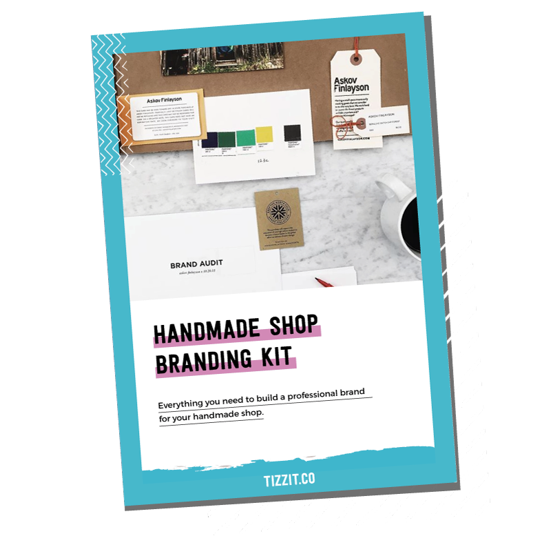
Grab this free handmade shop branding bundle!
SIGN UP BELOW TO GET ACCESS TO THIS BRANDING + PACKAGING BUNDLE MADE EXCLUSIVELY FOR HANDMADE ENTREPRENEURS LIKE YOU!
A logo needs to be as simple as you can imagine it to be. Too many elements may look good while you’re designing it but will make your logo SO hard to see when it is printed or displayed small. Logos are mostly used as small elements, so the more happens there, the less readable and harder to remember it is. You don’t need leaves and branches, and 10 color gradients, and fine contour lines. The thing I see the most is illustrations turned into a logo. They are really pretty, but they are hard to actually see as they can turn into kind of a blurry dot while displayed on, let’s say, an iPhone. When I was learning graphic design, my teacher would CONSISTENTLY ask us to do “simpler” “simpler’ “simpler” logo designs. Eventually, he admitted some of the more complex ones were better but he wanted to train us. If you take famous logos, like Nike or McDonalds etc., they all have very simple designs, too.
One more thing to remember here is to accommodate for different layouts and sizes (vertical, horizontal square). Sometimes your logo will be in a horizontal layout (like the navigation bar on your website), and sometimes you may want it in square or vertical layout. My logo is not a good example here – if I put it on a square it would just look awkward. So I’m not saying I’m perfect, or that you need to have all this stuff figured out, but it’s something to remember. Think of how you would like to use your logo an adjust to that. Ideally, you would want to have two versions of your logo: one horizontal, and one that could be put on a square or in a circle.
Your logo doesn’t have to have to have a font, it might just be a symbol, but I would say that in 80% of cases there are fonts involved. The first rule here would be no more than 2 fonts. If you’re using more than 2 fonts, it’s too much happening already and it won’t look good while small. If you’re using 2 fonts, also make sure they are not competing with each other. This means don’t use 2 script or strong or any 2 similar fonts in general. Instead, you would want to have one font with character (e.g. a script, display or strong font), and compliment it with a more discreet one, so that they work together nicely.
While choosing fonts for your logo, please stay away from “free/standard fonts” as everyone uses them. They are GREAT for your body/paragraph fonts but they make logos look amateurish. Examples of those fonts are Helvetica, Papyrus, Comic Sans, Times New Roman. I know it’s important to save money when you are starting your business, but it’s often absolutely worth investing $15 in a creative, professionally designed font.
Trends are… trends. They don’t last forever, and I’m sure you don’t want to have to rebrand every 2 years because your logo or font feels “old”. Furthermore, trendy usually means everyone is doing the same thing which means you aren’t really standing out, you’re just another logo with the same font everybody is using. What you want to do instead is to focus on your brand personality and values rather than on what’s “trending” at the moment.
Trends in typography and graphic design are important to follow if you are a stationery designer but you should absolutely stay away from them when it comes to your logo. I’m not saying you can’t use those trends, simply you should use them for the right reason: they represent your brand. For example, when I designed Tizzit at first I was going to go with a watercolor, feminine font just because I think it’s pretty and it represents me. Then I took a step back from my design and realized that it would be a mistake – Tizzit is about something else, it’s joyful, supportive and colorful. That’s how I’ve landed with the branding I have now.
My tip here is to write down words that describe your brand’s personality and values and match those words with a font that represents them. It will help you not get carried away by a trend and using it instead just because you like it.
Now for my last recommendation: when you’re just starting out, you don’t want to go to a graphic designer to have your branding professionally done because, realistically speaking, it’s just too expensive. That’s why, if you’re not a graphic designer yourself and you don’t want to invest a lot of money you don’t make yet, my best advice is to use a simple, typographic logo. It simply never fails. I know it sounds boring, but it works great because it’s modern, it’s never going to get too busy, you can get a cheap, professionally designed font on Creative Market, and it simply looks good.
That’s it for today, I hope it was helpful. If you would like to get feedback on your logo, make sure to join the free Facebook group for makers and handmade shop owners here.
you might also like…
related articles

If you want to be found in search results on Etsy, you need to optimize your product listing for SEO. And if you want to
There has been a lot of talk in the Etsy community — and I mean A LOT of talk — about Etsy’s payment account reserve
Anyone who knows me knows that I am a HUGE advocate for using email marketing to grow and scale your handmade business. But you may
Sign up below and get instant access to a collection of FREE practical guides, workbooks, and checklists that will help you start, grow and profit from your handmade shop. (without pulling your hair out!).
disclaimer
subscribe to youtube
become a member
get in touch
We acknowledge and give thanks to the Budawang and Yuin people, the Traditional Owners of the land we work and live on. We pay our respects to all Aboriginal and Torres Strait Islander Peoples and elders past, present and emerging.
4-step Maker’s Roadmap System
Library of In-Depth Courses and Training
Live Monthly Coaching Sessions
A Supportive Online Community
close
We hate spam too. Unsubscribe at any time.
close
We hate spam too. Unsubscribe at any time.
close
We hate spam too. Unsubscribe at any time.

download this complete
shop branding kit

Free packaging and branding resources